Redesigning for an on-brand, clean reading experience
How I led the redesign of Rasa's developer blog to align with the existing web properties and design system.
In 2021, together with our frontend engineer, I drove a full redesign and development of the Rasa blog, which was dedicated to Rasa product and community updates. The existing platform, using a Ghost.org theme, needed re-aligning towards Rasa's existing web properties and foundational design system.
-
Company
Rasa (full-time) -
Role
Visual design, UX/UI design, Project Management -
Year
2021
The Process
As a first step, I gathered requirements and identified pain points with the old theme in cross-functional meetings between the Marketing/Growth and Developer Relations teams. After conducting brainstorming sessions, and combing our backlog of issues and reported bugs, we compiled a list of objectives for the rebuild — which I’ll detail, along with how we addressed each one.
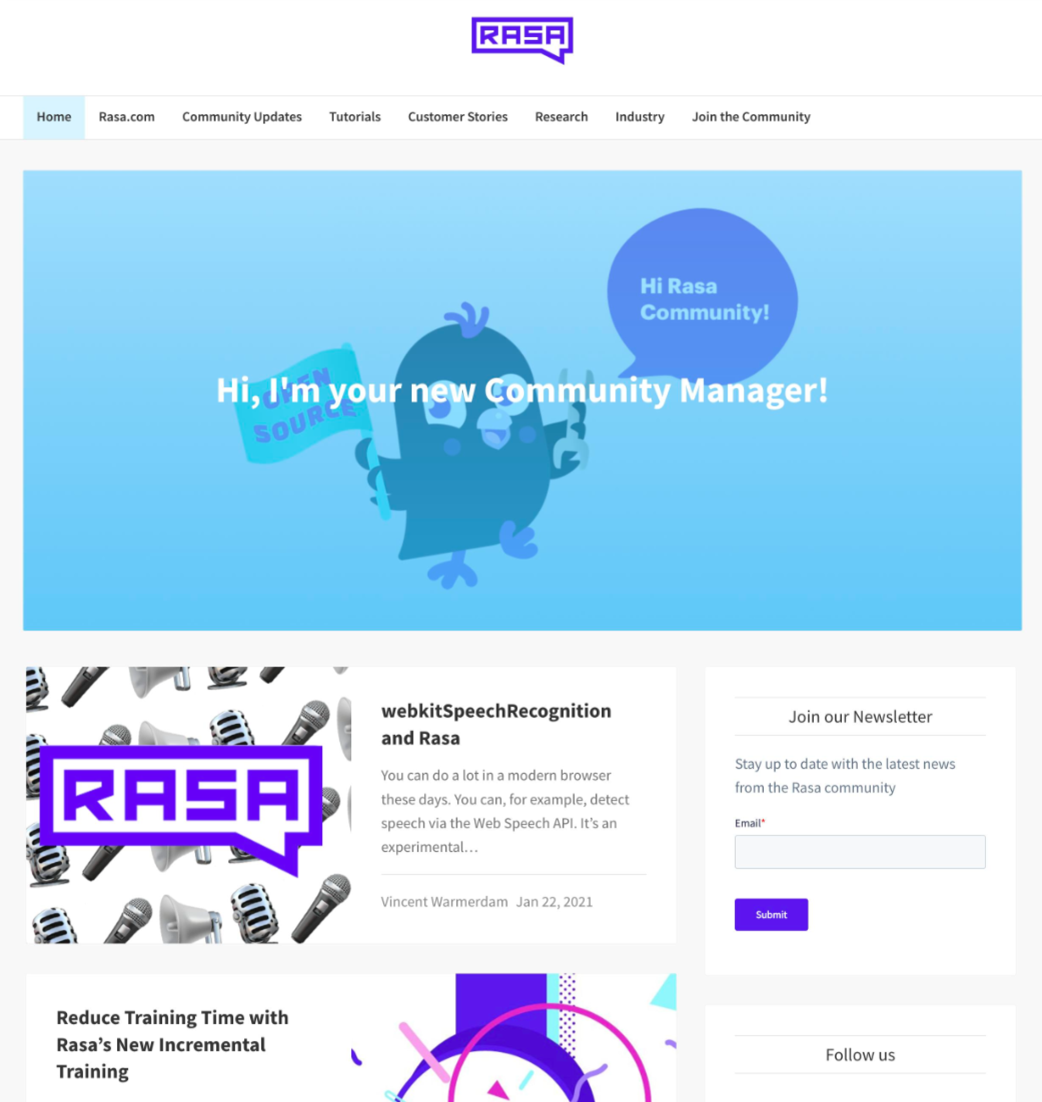
Issue: Visual alignment with rasa.com and the design system
The problem: while the Ghost blog had minimal styling applied to be on-brand, it looked visually inconsistent with the Rasa website and other web properties.
How we solved it
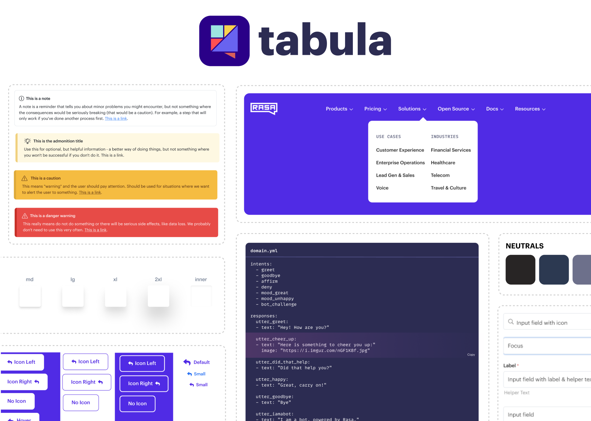
In the months prior to the redesign, I had already started working with our frontend engineer to document the design system (Tabula) for Rasa’s web properties in Figma. We figured this was the perfect opportunity to test it out and continue pushing the design system forward.
This meant I could quickly click together layouts, getting feedback from the marketing and dev rel teams, while also collaborating with the engineer to determine new components that would need to be created and how that would map to DatoCMS.
Improved Information Hierarchy and UX
The problem: the previous Ghost blog was separate from the main Rasa website, featuring only a link back to “rasa.com” in the top navigation. Social media drove the majority of traffic, with Analytics data showing that most users directly entered posts and left without exploring other pages. Further insights from Analytics and user interviews revealed the blog categories were unclear, and users weren’t sure where to find types of posts.
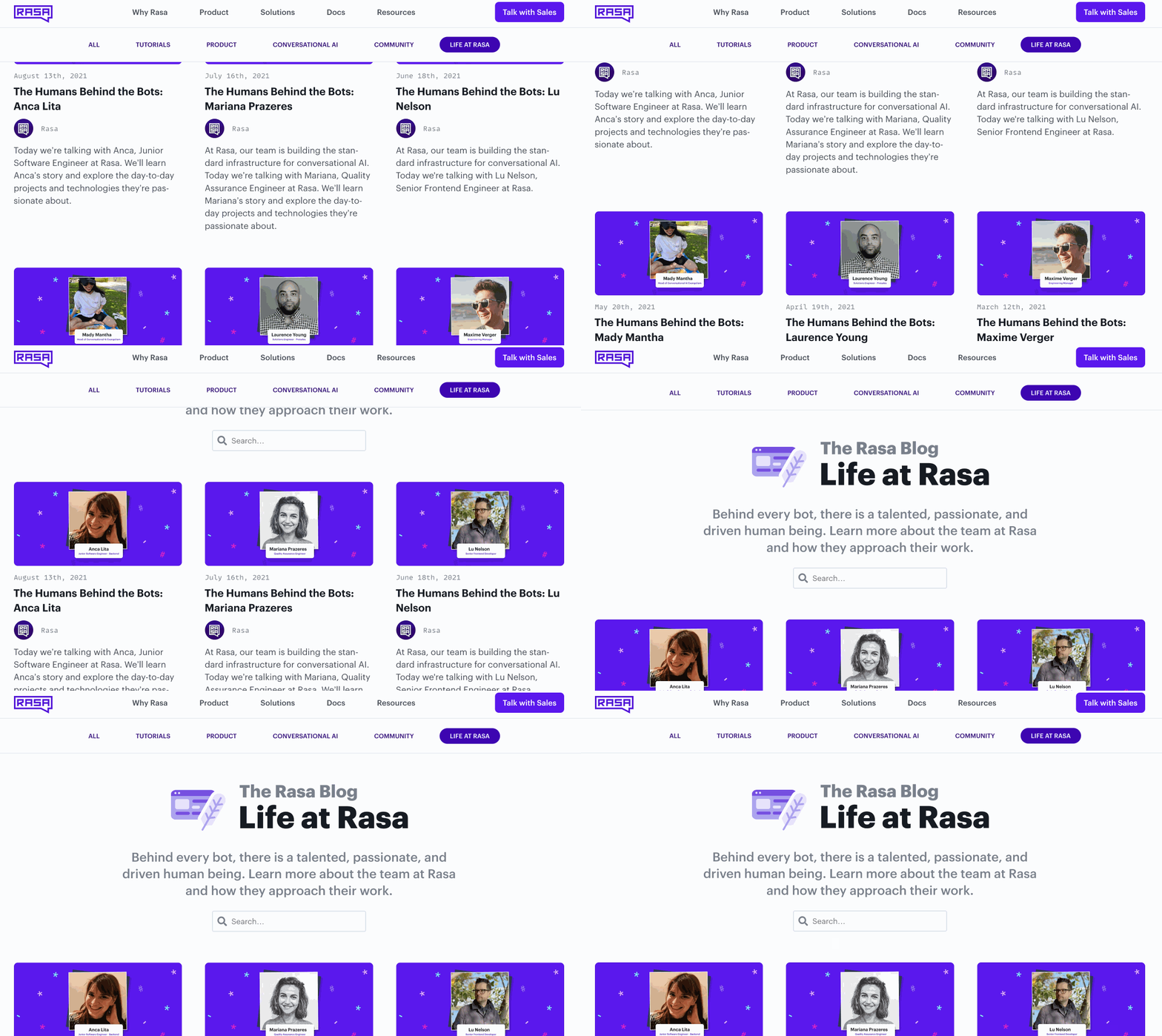
Additionally, there was another separate Hubspot site for employer branding related posts, e.g. interviews with team members about their role. Managing it became increasingly challenging, both in terms of publishing and SEO.
How we solved it
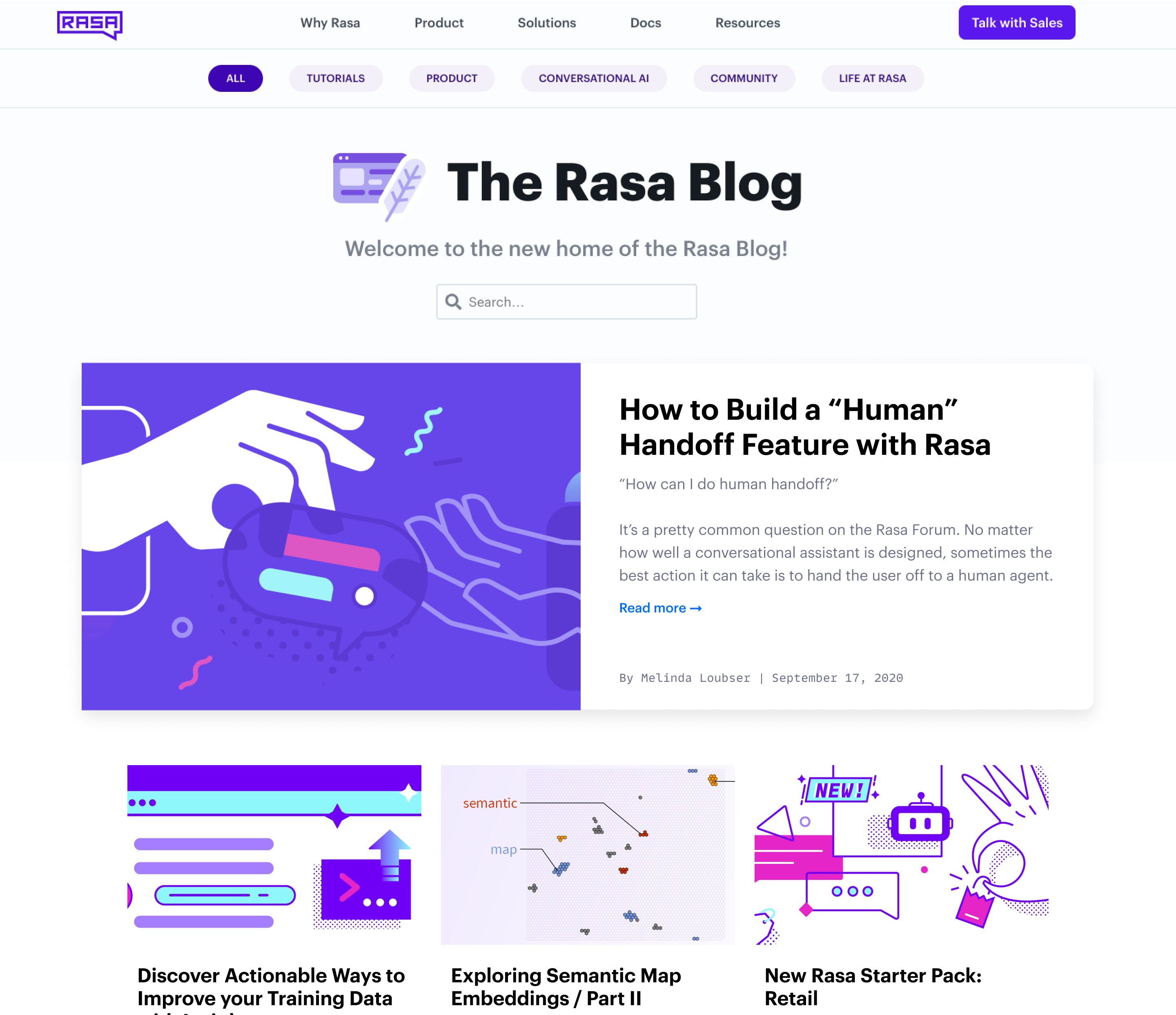
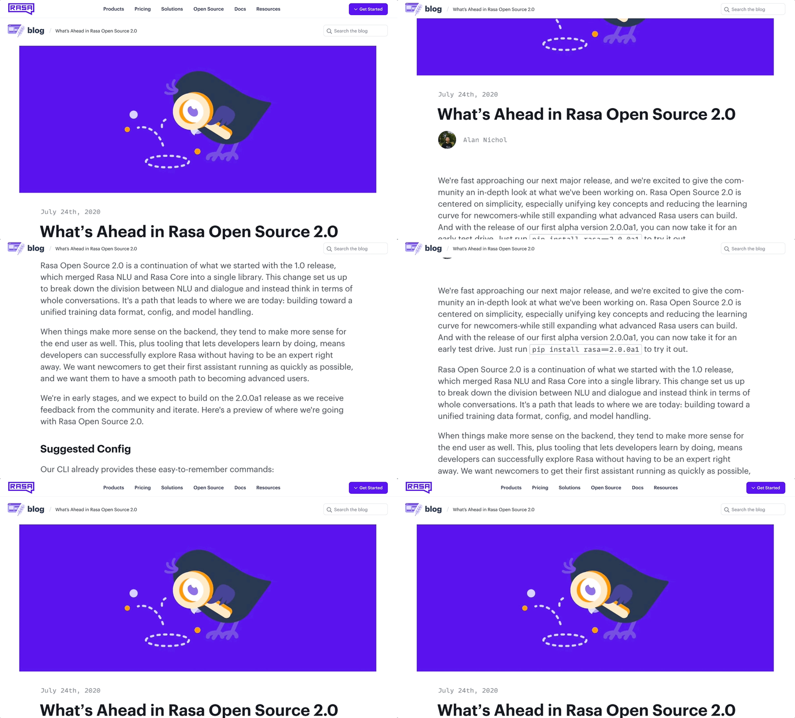
I collaborated with our Developer Marketing Manager to streamline categories, championed within the marketing/ops teams to merge the employer branding posts with the main blog, and explored top-level navigation options that maintained sub-branding and links to rasa.com.
Once we had finalised categories, I spent a few design jams with the engineer to explore different options for the top-level navigation. We wanted to maintain the sub-branding and make it clear that you’re on the Rasa Blog, while still maintaining links to rasa.com.
Streamlined Publisher & User Experience
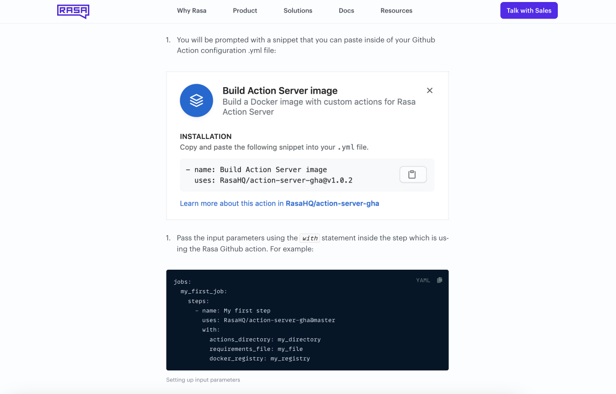
The problem: a key requirement from the Developer Relations team was to improve support for various types of content and embeds. A code tutorial might have code snippets or Jupyter Notebook embeds; a product announcement may need images, pull quotes and videos.
We also wanted to enhance the reading experience for users, aiming for a cleaner layout and better typography.
How we solved it
We took existing components we’d designed for the Rasa Docs, such as code snippets, video embeds, and repurposed these elements where possible, along with adding new components for all stakeholder requirements.
After confirming via Hotjar and Google Analytics data that the previous sidebar was underutilized, I tested several rounds of design adjustments for a cleaner reading experience.
Bug Squashing and Improved Search Functionality
The problem: through user and stakeholder interviews and previous bug reports, we knew that the search function on the previous theme was buggy, and a well-sought out feature for users.
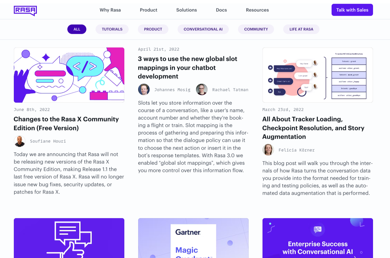
Another issue was that the previous blog theme relied heavily on images - a post couldn’t be published without an image, or it would break the site. We also identified during user tests that the design of the “featured post” on the previous blog was confusing and unclear it was even a post.
How we solved it
The search issue opened up an opportunity to both improve the code framework, but also steps towards a unified search across the website, docs and blog, using Algolia. As a first step, we added the search bar prominently across the user journey.
To address the reliance on images, I designed the grid layout and post layout in a way that would still work in the absence of images.
Project Results
The blog redesign was well received by stakeholders, and feedback from others was strong. It marked a first step towards unifying our web properties, and improving both brand consistency and code infrastructure.
For the internal stakeholders, we improved the publishing workflow for everyone responsible for creating content - both the Developer Marketing team and Operations team.
Page loading times and bounce rate were also significantly improved upon.
